Creating support on financial tracking for Money Map
MoneyMap is a personal finance platform that transforms complex financial data into clear, actionable insights—empowering users to manage their money with confidence.
In this personal project, I explored how to simplify financial documents and make budgeting more intuitive through UX/UI design methods. I used research, ideation, and interface design to build a solution that supports users in making informed decisions.
Timeline
Tools
Role
UX/UI designer
3 months
Figma
People often struggle to manage their finances, track their spending, and plan budgets effectively. Many find it hard to get financial insights without complicated tools.
Problem
Solutions
I designed a platform that simplifies money tracking through clear visuals, helps users plan budgets with categorized expenses, and offers personalized financial tips without overwhelming the user with complex analysis.

Key Insights from research
To better understand the market, I began with a Competitor Analysis and extracted key insights from potential users to inform my design decisions.
What Users struggle with
"I often feel overwhelmed by managing multiple aspects of my finances, and I wish it was easier to control my spending across categories and set clear goals."
Difficulty in tracking spending across various categories (e.g., groceries, transportation, savings)
Lack of real-time insights into their financial progress
Difficulty in maintaining a clear overview of financial goals, especially with irregular income or unpredictable expenses
Limited understanding of spending habits and how they affect long-term goals
Lack of personalized financial advice to guide users toward optimal saving strategies
"I want to feel in control of my finances without spending too much time on budgeting, and I wish I had personalized insights that could guide me."
Simplify budgeting without losing important details about their spending
Have real-time visualizations of their spending and income across different categories
Set and track financial goals, such as saving for a big purchase or paying off debt
Receive automated suggestions to optimize their spending based on their habits
Organize and monitor savings for specific goals (e.g., vacations, emergency funds)
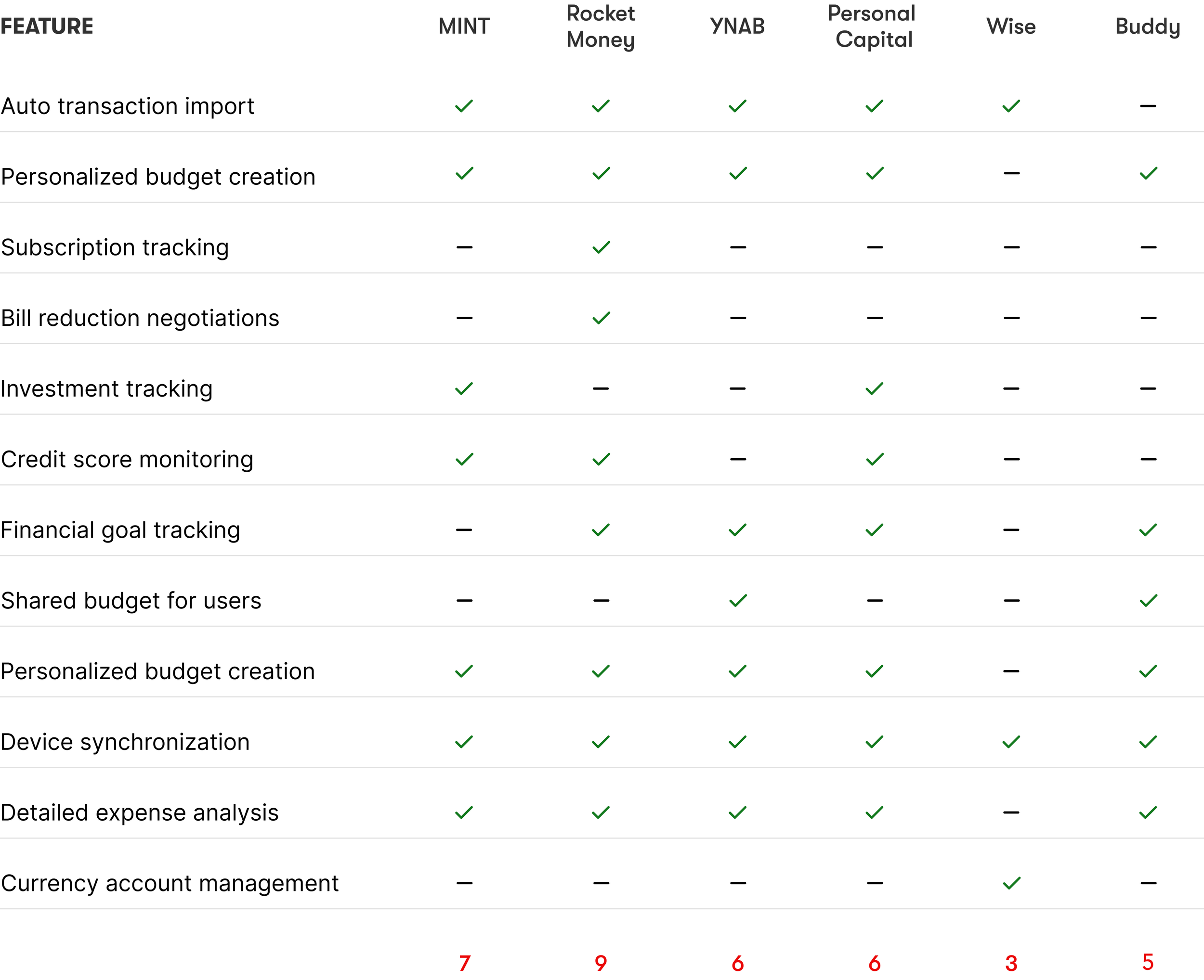
Competitor Analysis
This analysis helped identify gaps in existing tools, such as the lack of shared budgets and automated suggestions, which I later addressed in my solution.
Persona
To ensure the product truly aligns with user needs, I developed two personas grounded in my research insights. These personas capture the goals, challenges, and behaviors of the target audience.


User stories
To align the product with real-life needs, I translated research insights and persona pain points into actionable user stories. These stories helped me define key features and prioritize the most valuable interactions.
As a who has credits,
I want payment notifications and graphs,
so that I can avoid missed payments and manage debt consistently.
As a user with recurring and fluctuating expenses,
I want to be able to categorize my spending,
so I can identify areas where I can reduce costs.
As a user living with roommates,
I want to see a breakdown of rent and utility expenses,
so I can easily track my share of the costs.
As a user managing expenses,
I want to receive alerts when I approach spending limits,
so that I can stay within my budget.
As a user working with irregular income,
I want to track income changes and get budget recommendations,
so that I can better adapt to changes in my earnings.
As someone experiencing financial stress,
I want to receive advice on how to optimize my budget,
so I can reduce financial anxiety.
Product hypothesis
Before jumping into UI, I grounded every decision in the product hypotheses shaped by user research. Instead of designing screens for the sake of aesthetics, I focused on translating validated needs into meaningful interactions. Each visual element and layout structure was built to test or support a hypothesis—from category limits and budget alerts to shared access and automatic transaction tracking. This approach ensured that the final interface wasn’t just functional, but also deeply rooted in solving real problems.
The problem: difficult to stick to a planned budget due to unplanned expenses,
If we: add a "Daily Reminders" or "Budget Tips" feature that sends short messages about remaining budget balances in categories,
Then users will receive regular reminders, helping them avoid exceeding limits and stay on track with their financial goals.
The problem: users managing a shared budget (e.g., with roommates or partners) struggle to synchronize financial expenses,
If we: add a shared budget access feature with the ability to add multiple users so everyone can view and track shared expenses,
Then users with a shared budget will be able to coordinate their spending better and avoid duplicate purchases or budget revisions.
The problem: it’s hard to save money for specific categories due to inconvenient budget limit settings in the app,
If we: add the ability to set limits for each expense category with automatic reminders for exceeding the set limits,
Then users will better adhere to their planned budget and be able to save more.
The problem: difficult to stick to a planned budget due to untracked expenses and missed transactions,
If we: add an automated transaction import feature from bank accounts, along with notifications about unplanned expenses,
Then Users will easily track each transaction and have a clear overview of their spending, reducing their financial stress.
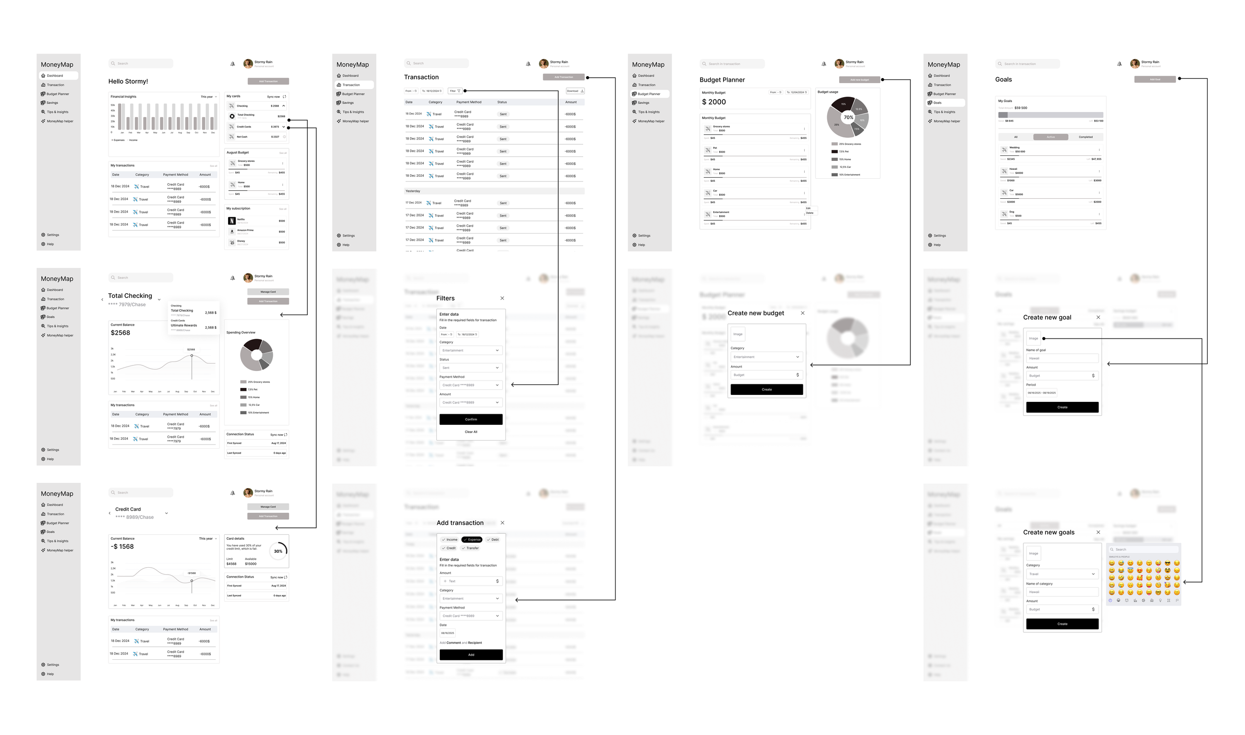
Wireframes
I created low-fidelity wireframes to validate layout, flow, and functionality before moving to high-fidelity designs. This helped me focus on structure and user logic without visual distractions and allowed for quick iteration based on feedback.
Usability testing confirmed that the budgeting process and menu navigation were intuitive, giving users a clear sense of orientation throughout the app.
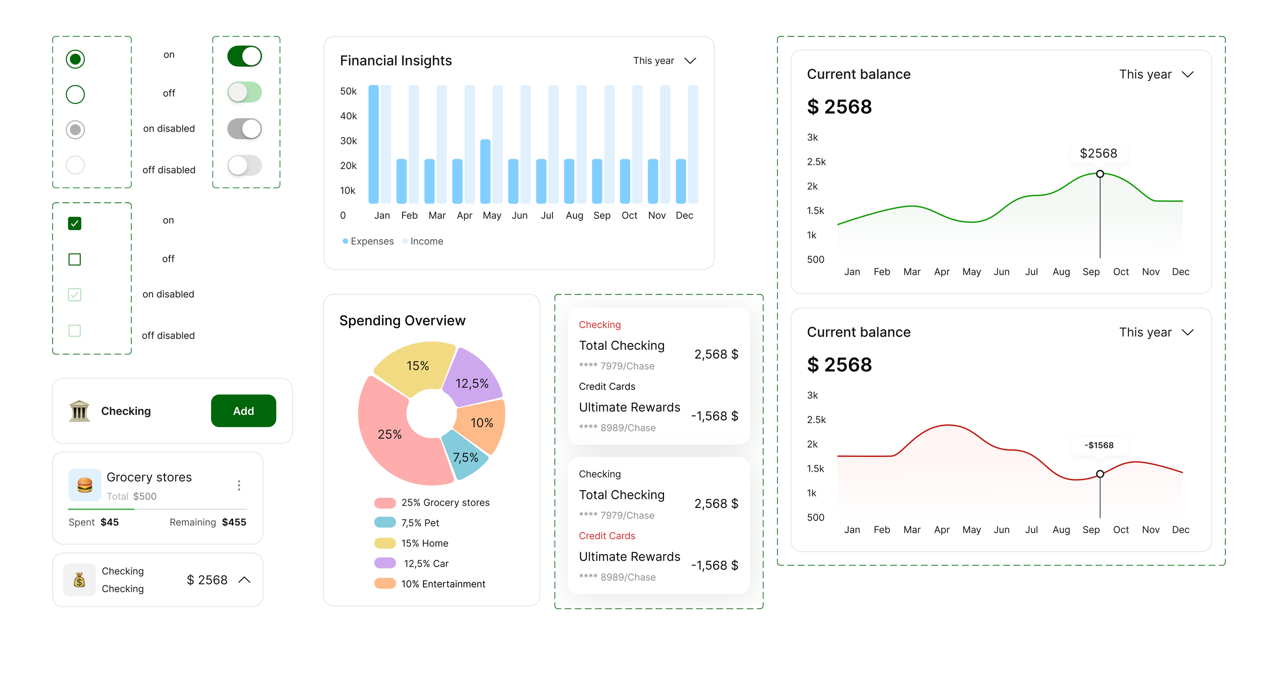
UI kit
To ensure visual consistency and design scalability, I created a comprehensive UI Kit that included typography styles, color palette, buttons, icons, and reusable components. This system streamlined my workflow and made it easier to maintain a cohesive visual language across all screens.
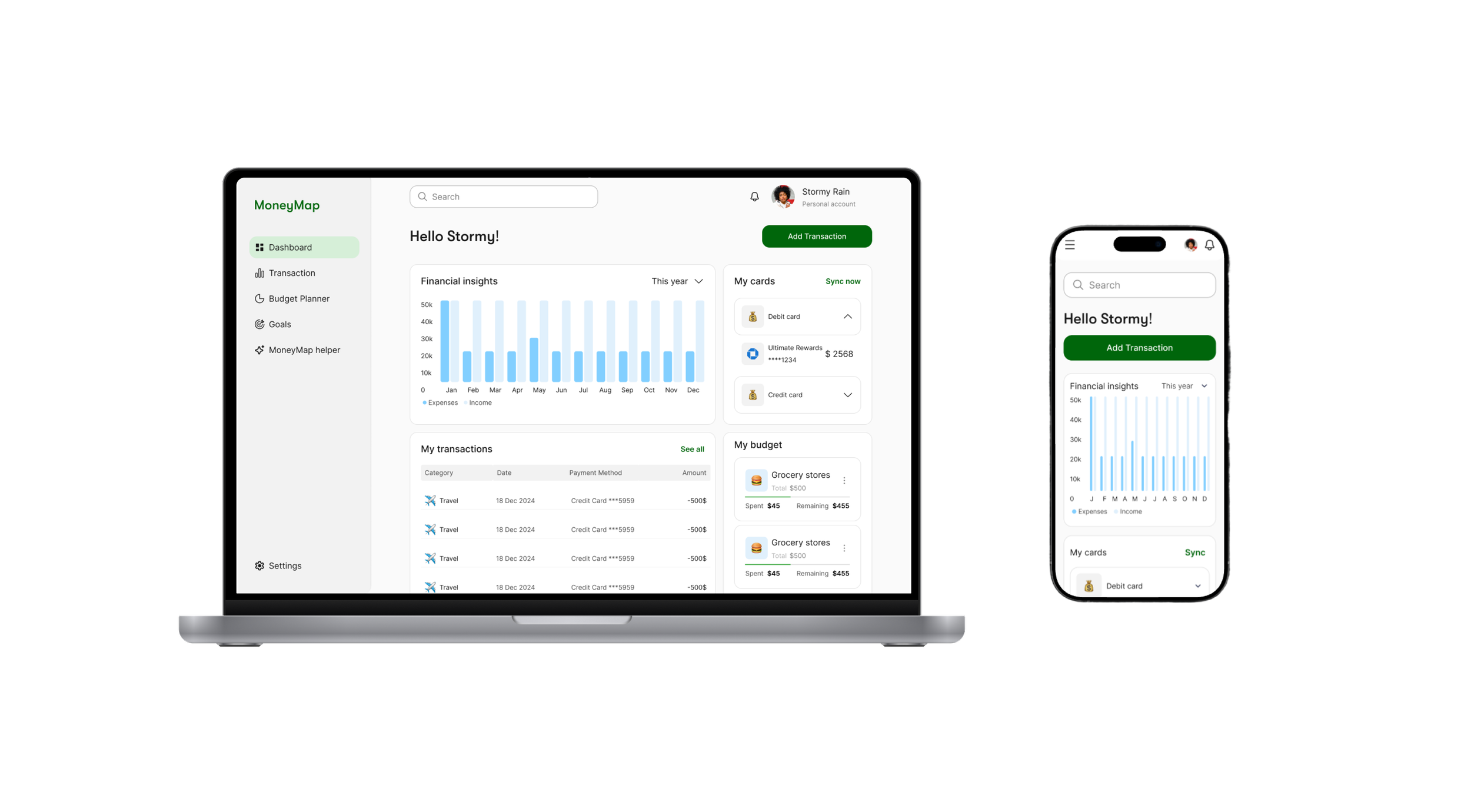
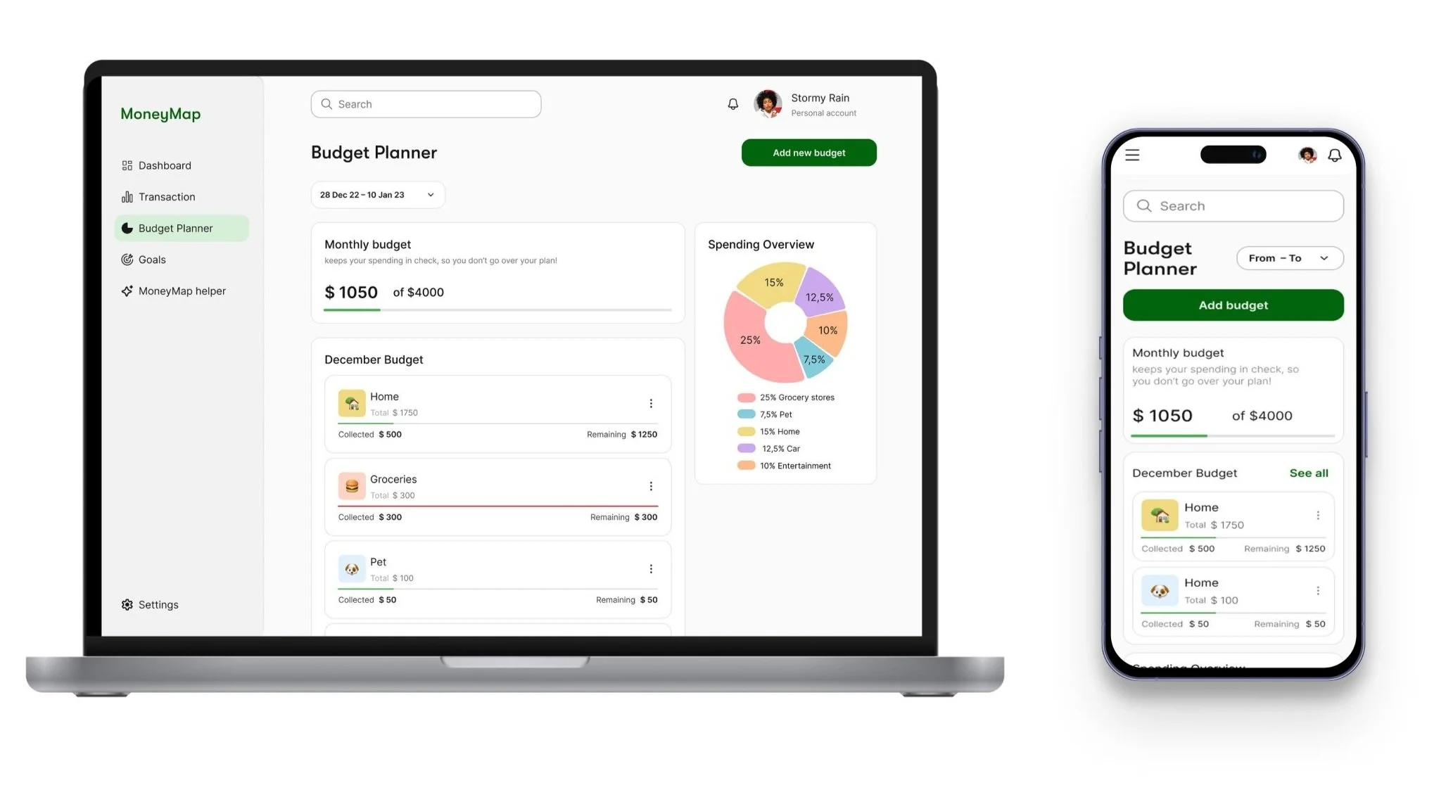
UI design
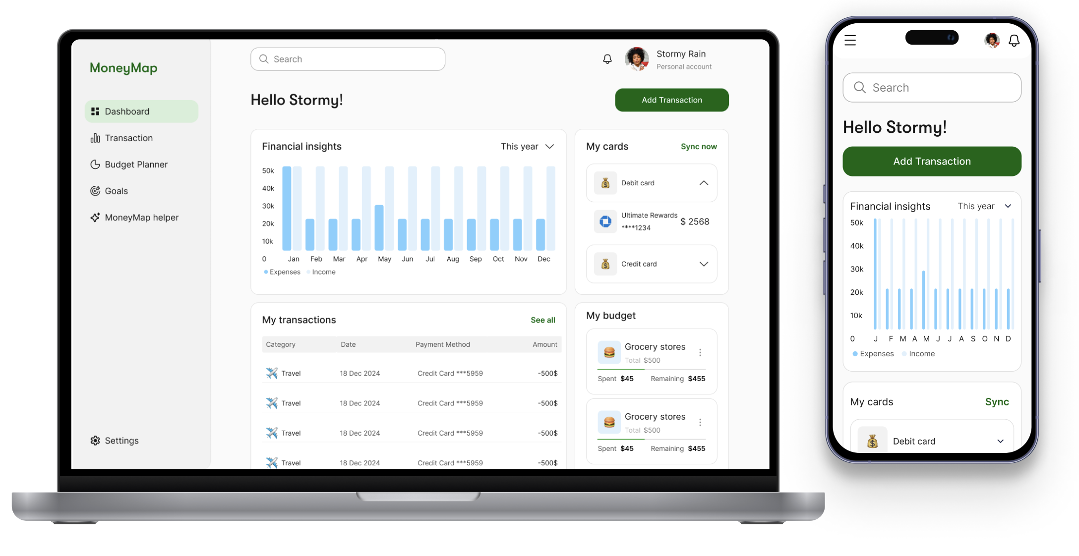
I designed the UI of MoneyMap to be clear, intuitive, and calming. Simple layouts, soft colors, and clear structure helped users navigate their finances confidently.
The dashboard brings together key actions like "Add transaction," budget overviews, and insights in one place—minimizing effort and maximizing clarity. I focused on visual hierarchy, contrast, and accessibility to reduce user stress.
Each design decision supported core product hypotheses. Category cards help manage spending, shared budget features support collaboration, and transaction summaries simplify tracking—ensuring every element solves a real user problem.

As a user with recurring and fluctuating expenses,
I want to be able to categorize my spending,
so I can identify areas where I can reduce costs.
As a user managing expenses,
I want to receive alerts when I approach spending limits,
so that I can stay within my budget.
As a user working with irregular income,
I want to track income changes and get budget recommendations,
so that I can better adapt to changes in my earnings.
Next Steps & Improvements
If developed further, I would continue improving MoneyMap based on user feedback and behavioral analytics. Early testing showed users appreciated simplicity and customization, so I would:
Add adaptive onboarding based on users' financial goals and experience level
Refine budgeting suggestions using AI-powered insights from spending patterns
Improve accessibility features like voice input and high-contrast modes
Expand shared budget functionality with roles/permissions for different users
Use product analytics to track drop-off points in setup flow and optimize retention
These steps would help build a more tailored, inclusive, and impactful experience that evolves with users over time.